
Monday, June 21, 2010
Value Study, back alley behind Dave Dornan's building in Helper
Old Home in Helper, Utah

Clothing Still Life

Abandoned Tire Shop

Cliff face in the late afternoon
 This painting is a litlle smaller than the other cliff painting I did and I did this one the afternoon before the other one. We ran out of light as it went down behind the mountain that was at my back so I kind of had to rush this painting so that is why it isn't as worked out as the other one. Dough shared some secrets about painting rocks and cliffs with us the next day that really helped as well!
Cliffs and Trees
 This is probably my favorite painting from the workshop. It was the second to last painting I did. Doug taught us a few secrets about painting rocks and matching color with rocks. I never realized that in rocks the under side facing the ground is warmer because it is reflecting light from the ground and the bottom side facing up towards the sky is cooler or more blue because it is reflecting the sky itself. One of the many awesome little tips I learned during the week long workshop. I love how thick some of the strokes are in this painting!
 Golf Course Painting
 This is the last painting that I did during my workshop in helper. I'm putting it on here first so that when you look at them the one I did at the beginning of the workshop is the first one you see and the last one is this one. Hopefully you all will see the progression that I was able to achieve in a weeks time. I sure can. This painting was really a challenge because I was up on a cliff overlooking the golf course and had to paint down below me. I really liked the composition though so I had to paint it! It's a really small painting about 5x7 or maybe a little smaller.
Green Grass and Old Houses
 I did this painting for the Ogden plein air painting competition two weekends ago. It was pretty challenging because I painted it in the rain. I went with my friend Matt Larson(check out his work, it's amazing) and we drove around the bad parts in Ogden looking for someplace to paint. We finally just ended up going behind an abandoned house and we painted whatever we saw. I thought this corner of the backyard was pretty cool. Lots of cool shapes and patterns and really loved how deep and saturated the green was due to the overcast light. Second attempt in a painting competition, didn't place but was told my painting got some votes, better than nothing anyway!
 Monday, June 7, 2010
The Narrows

Spring Hollow Waterfall
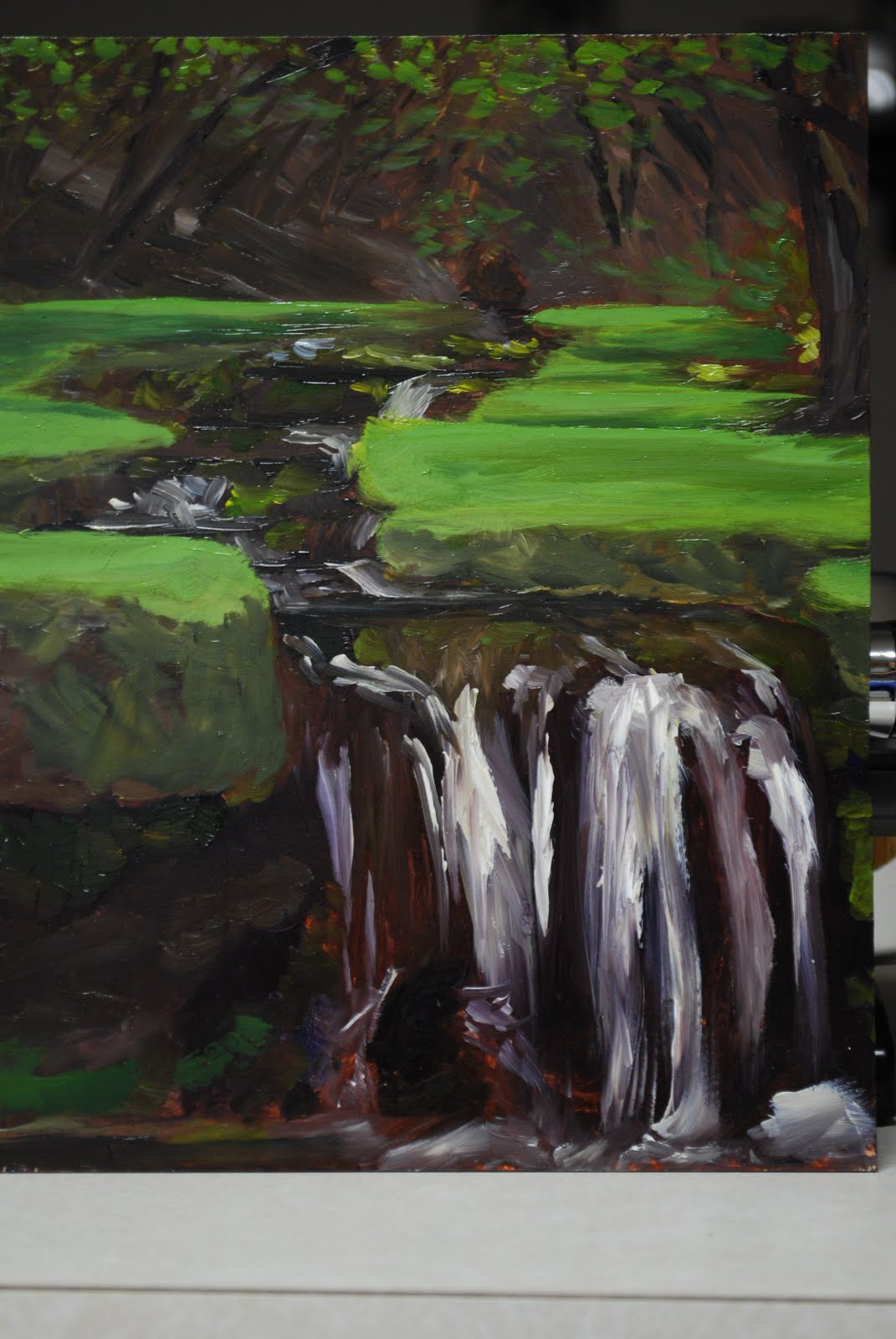
This painting is of a stream that flows through a campground up Logan Canyon. It has a series of small waterfalls that are completely covered in moss and vibrant green grass, and very canopied in by trees and foliage. I just loved the colors that I found there and had to go paint it! I did this small painting in about an hour and a half. It's just a study really on a 7x9 inch panel.
It's always fun to plein air paint because you inevitably end up with an audience on occasion. I had a group of older women who hike a few times a week together stop and take a picture with me and admire my painting(which I'd only just barely started and looked like crap at that point). But it came together in the end(when my audience finally allowed me to start painting again) and turned out pretty cool. I want to go back up and do some larger paintings that I spend a little more time on before too long so I'll post those when they get done. Sorry once again for the terrible crop!
The Blues

I did this painting mostly because I wanted to try and capture the emotion of sadness or loneliness. The figure is in a blue rain coat because the color blue is so often used to represent sadness. The colors are more saturated adding to the "rainy day" mood. The red background I chose for a few reasons. The first being that it was a striking color that worked well with the blue. The second being that red is so often used to describe passion, love, or the complete opposite, anger or hate. These are all feelings that one experiences when they are in love. This figure is experiencing "the blues" due to some type of romantic heartache she's experienced in her life. Her gaze is downward and inward towards her own thoughts and her own feelings. Amazing what you can do with color! I must thank my beautiful wife for posing for me! You're the best babe!
Sunday, June 6, 2010
O.C.D

Subscribe to:
Comments (Atom)